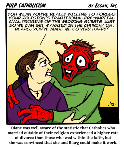
For reasons I might get into at some later time, I’m playing around with adding color on the computer right now (not my forte). The frustrating thing is that the contrast can change based on what angle you’re looking at the screen, so I have no idea what this will look like to other people. So, what do you think? Do you like the Ted Turner colorized version, or the original black and white?


4 comments:
I hate to tell you this, but the color version looks reaaallly good! But if it takes a long time, pick and choose which ones you'd like to do!
Between this and a couple of other comments on social media, I feel a consensus building.
I always prefer black and white because it emphasizes the line in line art.
I've always liked B&W myself, but i have to admit, the color looks pretty good on the screen. I'll probably go with color from now on just because I need the practice.
Post a Comment